Create a Smooth Shopping Experience With Custom Styled Checkout Pages
A shop sells best when the complete store has a consistent look and feel, that includes the checkout process your users go through when completing an order.
We’ve listened to our users and have implemented customization of the checkout process through nothing more than simple CSS.
We’ve kept things simple and efficient by using a file called checkout.css. Just add a checkout.css file to your theme and we’ll automatically detect that file and plug it into your checkout pages.
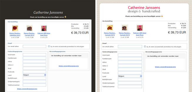
Here’s a comparison between the default checkout style on the left and a slightly customized version for one of the shops running on the SolidShops platform. The checkout.css file used to create a the right version contained only a handful of CSS rules.
It’s completely up to you how you want to customize the checkout page. In the example above, they only thing that was changed is the background image and a custom logo to create a consistent shopping experience. If you want to take it a step further and customize all elements on the checkout pages, go nuts.
Check out the documentation for exact instructions if you need them and let us know if you have done something creative with your checkout page!
Thanks again everyone for the valuable feedback you’ve given us. Thanks to you we are able to continuously improve SolidShops. Enjoy the update!

Let's get social shall we?
We'd love to know what you think. Join the conversation about your hosted e-commerce solution.